NBA names and logos are compact history lessons. Some describe a city perfectly; others survived a cross-country move, a franchise sale or a negotiated reassignment of historical records.
This guide starts with the official 30-team directory as of August 19, 2026, then traces the stories that make “Lakers,” “Jazz,” “Hornets” and other identities more complicated than their current map location suggests.
The 30 Current NBA Team Names
The official NBA directory contains 30 teams: 15 in each conference and five in each division. This is the safest baseline for current spelling. It uses LA Clippers rather than “Los Angeles Clippers” in the directory, for example, while the Lakers retain “Los Angeles.”
Eastern Conference identity map
| Division | Official current teams | Visual identity shorthand |
|---|---|---|
| Atlantic | Boston Celtics; Brooklyn Nets; New York Knicks; Philadelphia 76ers; Toronto Raptors | Heritage figures, city wordmarks, numerals and the raptor claw |
| Central | Chicago Bulls; Cleveland Cavaliers; Detroit Pistons; Indiana Pacers; Milwaukee Bucks | Animal head, weapons/letterform, basketball and motion symbols |
| Southeast | Atlanta Hawks; Charlotte Hornets; Miami Heat; Orlando Magic; Washington Wizards | Bird, insect, flaming ball, star trail and monument-inspired marks |
Several East identities are unusually stable. Chicago's bull head is recognizable without a city name; Boston's leprechaun connects the team to its Irish-American branding; Philadelphia's “76” points to 1776. Others have changed shape while preserving a central object: Atlanta repeatedly returns to a hawk, Milwaukee to a buck and Indiana to a basketball moving through a “P.”
Western Conference identity map
| Division | Official current teams | Visual identity shorthand |
|---|---|---|
| Northwest | Denver Nuggets; Minnesota Timberwolves; Oklahoma City Thunder; Portland Trail Blazers; Utah Jazz | Mountains/mining, wolf, shield, pinwheel and musical note |
| Pacific | Golden State Warriors; LA Clippers; Los Angeles Lakers; Phoenix Suns; Sacramento Kings | Bridge, nautical compass, ball streaks, sunburst and crown |
| Southwest | Dallas Mavericks; Houston Rockets; Memphis Grizzlies; New Orleans Pelicans; San Antonio Spurs | Horse, rocket, bear, state bird and spur |
The West contains more obvious relocation fossils. Lakes describe Minnesota better than Los Angeles; jazz is inseparable from New Orleans culture but remains in Utah; grizzly bears motivated a Vancouver identity that Memphis fans chose to keep. Those mismatches are not errors. They are evidence that a franchise name can accumulate value strong enough to survive geography.
A logo is also a family, not always one picture. Teams may use a primary crest, a secondary icon, a wordmark, uniform marks and special-edition art at the same time. The directory thumbnail is the current primary reference; it is not proof that every other official-looking symbol has been retired.
Names That Traveled to a New City
Relocation forces a choice: preserve brand equity or build an identity around the new home. The NBA contains both outcomes, which is why literal geography cannot explain every nickname.
Lakers, Jazz and Grizzlies
The Lakers began in Minneapolis in 1947. The name referenced Minnesota's “Land of 10,000 Lakes” identity and stayed when the franchise moved to Los Angeles in 1960. Purple and gold, a slanted wordmark and basketball streaks eventually made “Lakers” feel native to Los Angeles even though the original word came from Minnesota.
The Jazz began as a New Orleans expansion team in 1974. Club history says officials chose “Jazz” for its association with collective improvisation, an obvious cultural fit in New Orleans. Ownership moved the franchise to Salt Lake City in 1979 and retained both the name and, initially, its musical note imagery. Utah has since used mountains and state colors in parts of its visual system, but the note remains the clearest link to the original city.
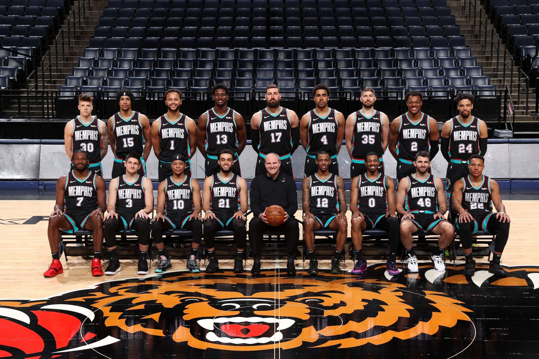
The Grizzlies entered the NBA in Vancouver in 1995. The animal represented British Columbia, where grizzly bears are indigenous and culturally prominent. When the team moved to Memphis in 2001, management considered a locally specific alternative. The club's own history says season-ticket holders, fans and businesses wanted “Grizzlies” retained. Memphis later built “Grit and Grind” around the bear, demonstrating how supporters can give an inherited name a second meaning.
SuperSonics to Thunder
Seattle's SuperSonics identity did not simply appear on Oklahoma City's uniforms. After relocation ahead of 2008-09, the franchise unveiled the Oklahoma City Thunder name, a shield-like primary logo and colors described as drawing from an Oklahoma sunset. The announcement emphasized energy, power and the word “Thunder,” creating a clean break in day-to-day branding.
The historical record still connects the franchise timeline: the NBA's Thunder championship history counts Seattle's 1979 title as the franchise's championship. At the same time, Seattle supporters regard the SuperSonics name, colors and iconography as their city's basketball identity. That is why “same franchise lineage” and “same brand” are not interchangeable statements.
Thunder branding was deliberately local and forward-looking. Blue became the dominant field, with sunset colors and a compact OKC mark. Unlike Lakers or Jazz, the organization did not ask the old nickname to stretch across geography. It used a new name to announce a new market while the statistical lineage remained connected.
The four examples suggest a practical rule: a name survives when recognition and fan attachment outweigh geographic mismatch. A new name wins when the incoming city demands ownership of the identity or the old brand is culturally inseparable from the departed market.
Major Renames and Reassigned Histories
Not every identity change follows relocation. Washington renamed itself in place, while Charlotte and New Orleans produced the league's most important lesson in separating an operating franchise from a city's official basketball history.
Bullets to Wizards
The current Wizards lineage began as the Chicago Packers in 1961, became the Chicago Zephyrs in 1962, moved to Baltimore as the Bullets in 1963 and later used Capital and Washington Bullets. Those changes generated very different visual languages: early orange and blue, the famous red-white-and-blue stripes, then simpler patriotic uniforms.
Owner Abe Pollin decided in 1996 that the organization should adopt a nonviolent nickname. “Wizards” arrived for 1997-98 with a full visual break: lighter blue, black and bronze, a wizard/moon motif and new wordmarks. It is a clear case where name, color and logo changed while the club remained in the Washington market.
The brand later returned to red, white and blue, showing that a rebrand does not have to choose between old and new. The nickname stayed Wizards, but patriotic colors and monument/basketball forms rebuilt continuity with the Bullets era. Fans can recognize historical influence without claiming a retro Bullets mark is the current primary logo.
The Hornets, Bobcats and Pelicans timeline
Charlotte's first NBA team played as the Hornets from 1988 through 2002, then moved to New Orleans with the nickname. The NBA returned to Charlotte in 2004 as the Bobcats. New Orleans changed from Hornets to Pelicans for 2013-14, choosing Louisiana's state bird and freeing the Hornets identity to return.
The Board of Governors approved Charlotte's Bobcats-to-Hornets change for 2014-15. The parties also agreed on history: Charlotte's current Hornets received the statistical records and history of Charlotte basketball from 1988-2002 plus the Bobcats era from 2004-14. The Pelicans retained New Orleans history beginning in 2002-03.
That allocation creates a sentence that initially sounds contradictory but is accurate: the operating organization that moved from Charlotte to New Orleans is part of the Pelicans' organizational path, while the old Charlotte Hornets records now belong to the current Charlotte Hornets history. Official league decisions, not a simple corporate family tree, determine how record books are presented.
Visually, the revived Hornets drew on teal, purple, a fierce hornet and the cultural memory of the 1990s without merely photocopying every old asset. The Pelicans adopted navy, red and gold with a pelican crest tied to Louisiana. The Bobcats orange-and-blue cat marks became a closed era that remains historically official but is not current branding.
Timeline shortcut
Charlotte Hornets (1988-2002) → Charlotte history returns to today's Hornets; Charlotte Bobcats (2004-14) → renamed Hornets; New Orleans Hornets (2002-13) → renamed Pelicans.
How NBA Logos Evolve Without Erasing Identity
A team rarely owns only one active piece of art. The primary logo anchors the directory and broad brand; a secondary logo may appear at center court or on shorts; a wordmark spells the name; an icon must survive small digital spaces. Uniform editions can add temporary marks without replacing that hierarchy.
Primary marks, secondary marks and wordmarks
Primary marks usually carry enough information to identify the club by themselves. Some include the full name, like a circular badge; others are so established that the image works without text. Secondary marks simplify or localize the identity—a letter, ball, skyline element or mascot head. Wordmarks prioritize readable team or city lettering.
Confusion begins when an alternate appears more often than the primary. A clean secondary icon may dominate social avatars and merchandise because it reads at small size. A Statement or City Edition symbol may fill broadcasts for several games. Neither fact proves the official primary changed. The team announcement and NBA directory determine status.
Utah's past brand updates illustrate a coordinated system: a J-note, circular secondary basketball, custom wordmarks, court graphics and uniform marks could coexist. Treating every asset as a competing “logo” misses their assigned jobs. Good identity systems repeat shapes and colors so the family feels related even when the marks differ.
Orlando 2025 and Minnesota 2026
Orlando's 2025 update returned a cascading star trail and used a star in the “A” of both Orlando and Magic wordmarks. The club retained Magic blue, black and silver and brought pinstripes back to its Association, Icon and Statement uniforms. This was nostalgia used as design material, not a literal restoration of one old file.
Minnesota unveiled an all-new logo, uniforms and courts in June 2026. The official release says the system emerged from franchise history and fan feedback, with tree imagery woven into the identity and evolved versions of the original blue, green and white palette. It also aligned the Iowa Wolves affiliate more closely with the parent brand.
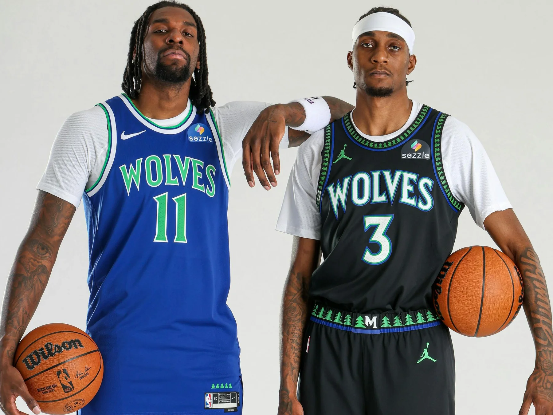
The two rebrands share a strategy: identify the memory fans value, then rebuild it for current media. Orlando emphasized stars and pinstripes; Minnesota emphasized trees and its early palette. Both changed more than a crest because a basketball brand lives on moving uniforms, a giant court, phone screens, broadcast graphics and merchandise.
This is also why “logo changes” lists need dates. A page assembled before June 2026 may show Minnesota's previous mark as current even when its historical information is otherwise accurate. Current-design questions demand a recent official announcement or directory check.
How to Identify and Use the Current Official Logo
Search results mix current primary marks, alternates, retired art, fan concepts and merchandise graphics. The safest identification method is chronological and source-based rather than visual guesswork.
Verification hierarchy and common traps
- Start with the NBA teams directory. Its team card is the current league-level primary display.
- Open the team's official site. Check the header, roster, schedule and current press materials for consistent use.
- Find the newest dated identity announcement. A release should specify whether the change covers the primary logo, secondary marks, uniforms, court or all of them.
- Separate permanent from edition-specific art. City, Classic and Statement uniforms can carry special symbols for one season or a limited schedule.
- Check the effective season. A logo unveiled in June may be described as “new” while the prior season's archive remains online.
Fan-made concepts are the most common trap. They often use professional mockups and familiar colors but have no team release. Retail listings create another: a licensed throwback is official merchandise, yet the mark on it may be historically official rather than the current primary. Video games and social templates may update on a different schedule.
Color alone is insufficient. Teams use alternate palettes, grayscale marks and special-edition courts. Shape alone can also mislead when a secondary icon resembles a retired primary. Verify the asset's assigned role in a current team source.
What a logo timeline can—and cannot—tell you
A timeline is excellent for understanding why a mark changed. Washington's jersey archive links relocation, name changes and color eras. Memphis's Classic Edition page explains how an early Memphis uniform adapted a Vancouver design. These sources connect design decisions to specific seasons and places.
A timeline cannot grant permission to reuse the image. NBA and team names and logos are protected intellectual property. Editorial identification, merchandise production and a site's decorative use involve different rights questions. Publishers should use appropriately licensed assets, follow league/team guidelines and seek legal advice for commercial applications.
A timeline also cannot prove that a design returned permanently. A Classic Edition intentionally brings back old work. Anniversary patches, alternate courts and one-night tributes do the same. The current primary changes only when the official identity system changes.
| Question | Best source |
|---|---|
| What is the team called now? | NBA official teams directory |
| Did the primary logo change? | Dated official team/NBA identity announcement |
| Is this a throwback? | Official uniform or Classic Edition page |
| Who owns a city's old records? | League/team history reassignment announcement |
| May I use the logo commercially? | Rights holder/license terms and qualified legal advice |
The underlying lesson is simple: names tell migration and community stories; logos organize those stories into a visual system. A current list should be dated, a historical list should distinguish primary and alternate marks, and neither should mistake familiarity for authorization.
Bottom line
Use the NBA directory for today's 30 names and primary displays, dated team releases for changes, and official history pages for relocated or reassigned identities.
Sign in with Google to join the discussion.